It’s Thursday-time for another entry. The once a week thing seems to be working fine-it doesn’t hurt that I don’t want to do anything right now…
Not much happened the past week: Thurs. dinner at the UUFLB RE teacher’s house for Ramadan, Pilates and a little tennis on Sat. (Erika’s not bad), church and lunch with Tracy and Hannah at the Rainforest Cafe-the food was totally late, and the usual workweek-working on graphics, icons, and a redesign. Erika got a new printer yesterday.
There’s been some fascinating work done with electoral maps this cycle. Ben Werschkul at the NY Times, Sara Fabrikant at UCSB, Mark Newman at UMich, Robert Vanderbei at Princeton, andSuresh Venkatasubramanian at AT&T Labs (I might find more, or not). Essentially people are taking the county by county tallies and trying to get a better look at how people voted. This is a useful exercise, and depending on the analysis, shows a few things.
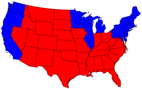
There are four types of maps-first is the state by state you’re used to seeing.
This one is really useless, as all it shows is how the electoral college went-basically that Bush took the whole country except for the far West, the Northeast and most of the Great Lakes.
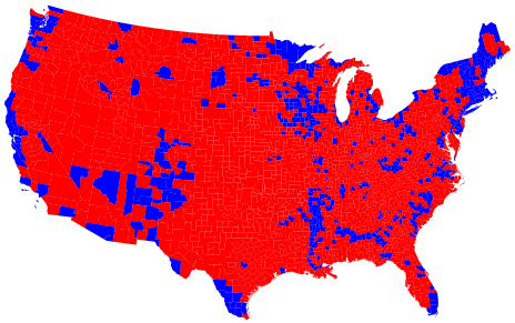
The second is a county by county breakdown, which is a bit more revealing-it shows that Democratic voting is clustered in largely urban areas, all over the country.
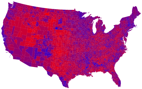
The third is the county by county, but shaded so that the actual vote tallies, red vs blue, run along a spectrum based on percent of red vs blue.
This is much, much more revealing, and shows that the actual vote counts of a narrow victory for Bush is true all over the country. There are very few places that weren’t fairly evenly divided Reps vs Dems. This makes for a purple map, rather than a red vs blue map.
Finally there’s the cartogram. This map has each county’s size changed to reflect the population of that county. This distorts the U.S. map to look something like some odd bird or a fish.
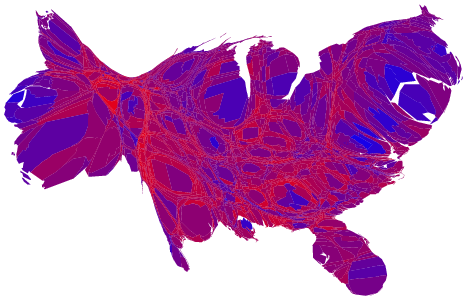
This one takes a bit of getting used to-it’s like the world maps that the “State of the World Atlas” did. Once unraveled, this view makes it much clearer to see how the U.S. is leaning. It highlights the fact that urban areas are much more left leaning, and the hardcore rightists live mostly in areas with smaller populations. Since urbanization is continuing, and rural areas lose population, the rightward drift can’t continue forever. Since it’s basically driven by fear anyways, and the Christian Right, their numbers will dwindle over time. The problem is that right now they’re strong, and are working really hard to consolidate their power. We’ll see-I like that Ashcroft has left, but the new guy doesn’t seem much better, three Supremes are going to be next-that’s going to be SO ugly. I’m still worried by the Dominionist thing-hopefully things won’t go their way-what with DeLay’s problems, and maybe more moderates will wake up and realize what’s going on. It just irks me that people can vote for this administration with all the bad things they’ve done. I guess they’re closing their eyes to it. The Dems need to think hard about how to court those moderates, and before midterms. There’s been reports of problems with voting, but in some respects this goes on all the time-now it’s just more prominent. I did hear that one state is going to recount, and I learned that Kerry’s concession speech means nothing legally.
Arafat died. Hopefully this will shake things up a bit, without too much violence. They really need to stop it. I learned a new term-Judaized Christians-means Israel right or wrong. Check out “We hold these Truths”-dude’s a bit of a paranoid Christian nutjob, but says some interesting things.
I picked up the new copy of Firefox-much better than aieeeee. I like the add-ons too. I also picked up some code to set up a Beowulf cluster, and Icon, which I haven’t seen in awhile, and a mapping program. I also got a copy of SuSE Linux in the mail, which is kOOl, because it doesn’t come on CDs for the regular version-I’ll use it as a base to make a CD version…
Gotta go to lunch-see you next week…
